When I was showing a friend the advantages of python over Excel/LibreCalc, I remembered the truly beautiful Seaborn Library which produces plots like the following.
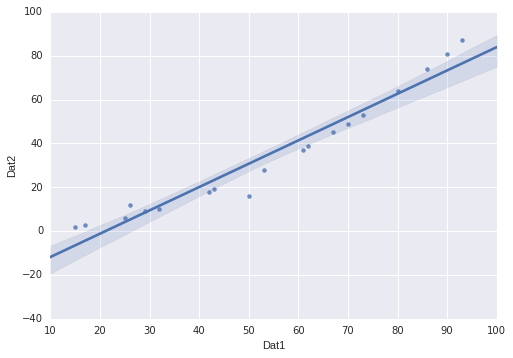
As one can see, this a standard scatterplot of a two dimensional dataset together with a regression line fitted to it - the light blue shade indicates a 95% confidence interval btw. It turns out that creating this standard diagram is as easy as
import pandas as pd
import seaborn as sns
...
#create/load your pandas dataframe here
sns.regplot(x="your_dataframe_column1", y="your_dataframe_column2",
            data=your_pandas_dataframe)
Of course, you might need to have a 10 minute look at Pandas, as well.